

Just days ago Facebook announced that they will be and have been working to map out the world through the use of artificial intelligence and data science. This in order to create population density maps that are extremely accurate and much higher in resolution than most would imagine.
According to Facebook, this is being done so that when a disaster or perhaps other issues like disease occur, those who provide relief can and will be able to respond more appropriately. In this announcement, it was also presented that Facebook with the help of satellite imagery managed to already build a high-resolution population map for the entire continent of Africa. Similar high-resolution population maps have been published as well of about 22 countries.
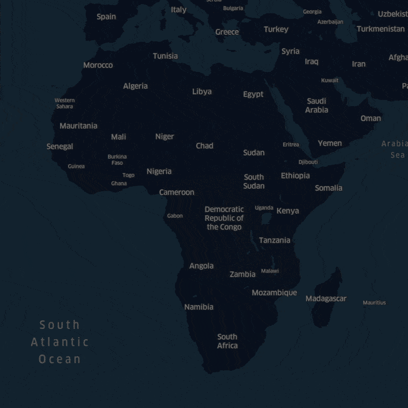
Image Via: Facebook
Facebook’s announcement noted as follows on their website:
When it is completed, humanitarian agencies will be able to determine how populations are distributed even in remote areas, so that health care workers can better reach households and relief workers can better distribute aid. Offering open data for free in a responsible way also enables Facebook researchers to better understand the many applications of their work and to guide their research in the right directions. No Facebook data has been or will be used in the project. The census and satellite data used contain no personally identifiable information.
Using a mixture of machine learning techniques, high-resolution satellite imagery, and population data, we mapped hundreds of millions of structures distributed across vast areas and then used that to extrapolate the local population density. The satellite maps used in this project were generated using commercially available satellite images from DigitalGlobe — the same type of imagery made available via publicly accessible mapping services. The other major data source for the maps is national census data for each country that was shared with Columbia University’s Center for International Earth Science Information Network (CIESIN), which collaborated with Facebook researchers on this project.
Since we released the first set of maps two years ago, they have improved how nonprofits do their work, how researchers learn, and how policies are developed. For example, in Malawi, the Red Cross and the Missing Maps program, in partnership with the Malawi Ministry of Health, used Facebook maps to inform a measles and rubella campaign. By showing that 97 percent of land space was uninhabited, the Red Cross was able to deploy 3,000 trained local volunteers to specific areas in need.
Along with today’s release of a new set of high-resolution maps, we are sharing details here on how we have approached this project.
When speaking to Cheddar, James Gill (one of Facebook’s software engineers) mentioned that through these maps they are uncovering so much. For instance ‘we had a time where they thought this village had 10,000 people, but it actually had about 40,000.’ This meaning they were able to change their calculations based off of their needs.
Cheddar also went on to report that these mapping efforts are benefiting Facebook’s business interests in some ways but are also free for many to see. Regarding helping Facebook itself, these maps are making them more aware of where WiFi hotspots need to be brought in and helping to eventually bring us all together in a more connected way.
When it comes to real-world results Facebook also says that this production model outperforms the old ones and that the results being obtained are some of the most accurate the world has ever seen. This kind of thing could be a great asset but also perhaps a bit much in the eyes of some, what do you think about population mapping on this scale?