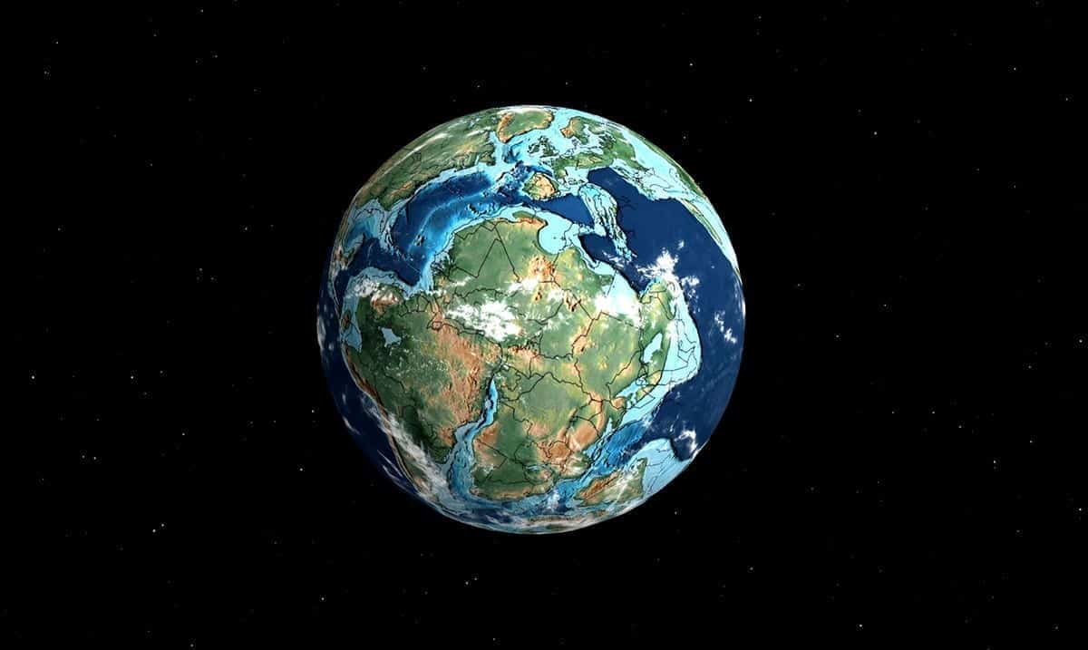
While not everyone realizes this, the Earth as we know it has been changing throughout the years. It might be as it is now but in the past, it was very much different.
In recent times a California-based paleontologist has managed to create an interactive map that helps us to better understand how the world has changed and it has many people blown away. While you might be able to place your home on a current map, you probably can’t do that on a map from long ago. Using this interactive map can really help you better understand the history of our planet as a whole.
To check out this interactive map for yourself, click here.
After looking up my hometown and how the land around it has changed throughout the years I using this map was able to note that until about 280 million years ago, my hometown was quite different. Sure, it was even then still quite different but that in comparison to 750 million years ago is an enormous change. Seeing what the US itself once looked like is quite mind-blowing for me and I’m sure seeing your country will also garner the same results within you.
Using this interactive map you can look at how the Earth changed as time passed going from 120 million years ago all the way up to 750 million years ago and well, the differences are more than enough to blow most people away. The more I use this map the more clear it becomes to me how unique Pangea truly was.
CNN reported as follows on this interactive map:
“It shows that our environment is dynamic and can change,” Webster, 30, told CNN. “The history of Earth is longer than we can conceive, and the current arrangement of plate tectonics and continents is an accident of time. It will be very different in the future, and Earth may outlast us all.”
Webster built the map as a web application that sits on top of another map which visualizes geological models created by geologist and paleogeographer Christopher Scotese. Scotese’s models describe plate tectonic development since 750 million years ago, not long after green algae first evolved in the Earth’s oceans.
Webster’s site also utilizes GPlates, a software used by geologists to visualize plate tectonic reconstructions and associated data through geological time.
Webster’s map visualization lets users enter their location and then plugs that location into plate tectonic models. The result is that users can see where towns and cities were located hundreds of millions of years ago. For example, you can see where New York City was located on the Pangea supercontinent.
“My software ‘geocodes’ the user’s location and then uses (Scotese’s) models to run their location backwards in time,” Webster said. “I built the interactive globe visualization and the geocoding and GPates integration myself so that people could plug in their own locations.”
When searching a location on the map, the website’s 3D rotatable globe will point out where on Earth that area was located million of years ago. The map will even show users what dinosaurs used to live nearby in the area they search.
I for one will be sharing this interesting map with everyone I know. Things like this are quite amazing and really need to be more known about especially by educators as a whole. What did your home look like millions of years ago? Was it as different as you had expected?

