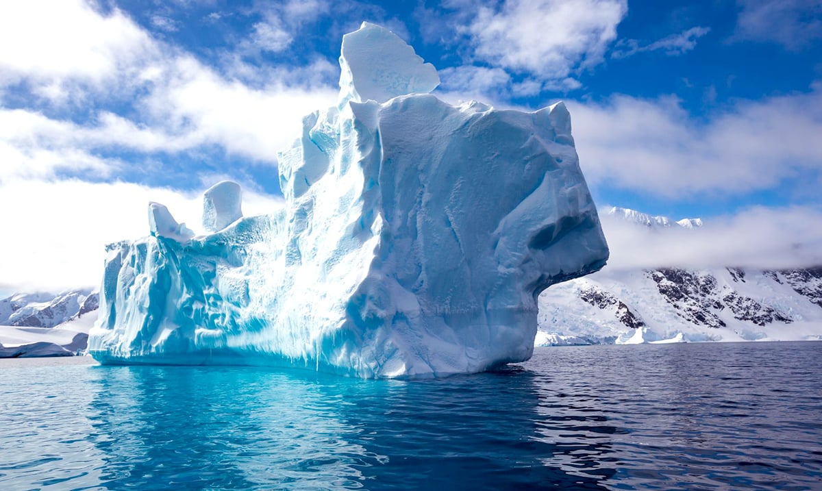
The destruction of the polar ice caps has been a hot topic in recent years, fueled by the ongoing debate surrounding climate change and global warming. However, with the Arctic region and Antarctica so far away, it’s easy to dismiss the problem entirely. Just how significant is the destruction?
Scientists have been sounding the alarm in recent years regarding just how fast Antarctica is shrinking. A recent study reported that just during the period from 1992 to 2017 nearly 3 trillion metric tons of ice was lost from the ice sheet, a loss that is so large it’s almost hard to comprehend. Even more alarming is the fact the rate of loss in West Antarctica during that time tripled, highlighting the fact that this problem is becoming bigger with each year that passes.
It’s difficult for scientists and researchers to hammer down an exact number due to inconsistencies in reporting. This is why the information made available to us may vary from source to source. “There are about 150 different estimates of ice loss from Antarctica and Greenland and they use different methods, they cover different proportions of the ice sheets and they cover different time periods,” explained the lead author of the study, Andrew Shepherd, a glaciologist at the University of Leeds in England. “You can always get a seemingly different number if you do it that way.”
Why is this such a big concern for Americans? As these icebergs break off Antarctica and travel out to melt in the ocean, they contribute to the change in sea level experienced around the world. In fact, to put it in perspective, if all of the ice in Antarctica were to melt, we would see sea level rise approximately 200 feet or the height of a 20-story building. This is the ultimate fear that haunts many dedicated researchers in the field.
Recognizing just how little the general public understands about the severity of the destruction of Antarctica, science animators Marlo Garnsworthy and Kevin Pluck from Pixel Movers & Makers set out to create an animation modeling the destruction that has occurred over the last 40 years. It reveals the pattern that has been recorded in which most icebergs break free from the ice sheet, traveling counter-clockwise around the continent of Antarctica before making its way into the North Atlantic waters between Greenland and Newfoundland, in an area known as ‘Iceberg Alley’.
Some of the bigger and more notable moments in the animation include the 2002 partial collapse of the Larsen B ice shelf, as well as the movement of the world’s largest recorded iceberg, Iceberg B-15 after it broke free from Antarctica in March of 2000.
“I was surprised and yet not to see an apparent uptick in iceberg flux in recent years,” stated Garnsworthy. “Certainly, the calving and breakup of B-15 and the collapse of Larsen B ice shelf in 2002 are pretty spectacular.”
Check out this incredible video, titled ‘Icebergs Alive’ by Pixel Movers & Makers here:
We’ve been looking forward to making this!
Iceberg flux from Antarctica from 1976-2017.
Most icebergs travel counter-clockwise around Antarctica before travelling north through “Iceberg Alley” to the ACC.#Antarctica #iceberg #glacier #IcebergAlley @kevpluck @MarloWordyBird pic.twitter.com/MTY0jZMSxv
— Pixel Movers & Makers (@PixelMnM) November 11, 2018
Feature Image Source: robynm | Pixabay

